If you’ve written a book, formatting is one of those steps that can sneak up on you. Preparing your manuscript for print, eBook, or online publishing isn’t just about making things look neat; it can change how your audience experiences your writing. I’m sharing what I’ve learned, from indie publishing to working with traditional presses so that you can choose the correct format without all the second-guessing.
Contents
- 1 The Fundamentals of Book Formatting
- 2 Your Book’s Destination: Print, eBook, and Beyond
- 3 Quick Formatting Guide: Start Here
- 4 What to Keep in Mind Before Formatting
- 5 Pro Formatting Tips for a Professional Look
- 6 Best Formatting Tools and Services
- 7 Frequently Asked Questions
- 8 Formatting: A Smart Investment for Authors
- 9 Related Articles
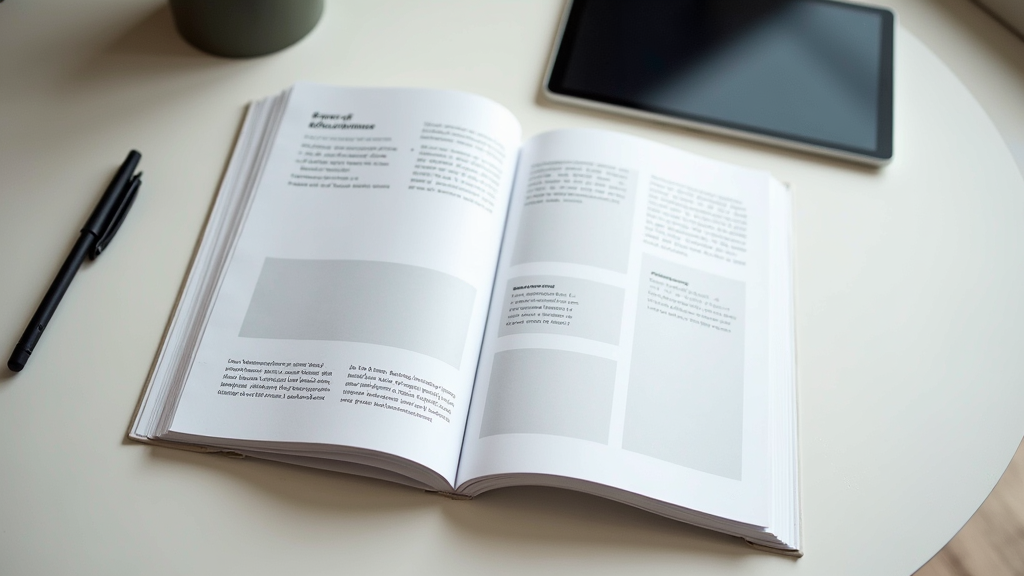
The Fundamentals of Book Formatting
Having a well-formatted book might not sound exciting, but it’s important for a smooth reading experience. It’s one of those behind-the-scenes jobs that helps your book look professional and polished, no matter where it ends up.
Formatting covers everything from picking font styles and sizes to setting margins, chapter headings, and even the way your table of contents links work in an eBook. If you’re submitting a book to different platforms—say, Kindle, Apple Books, bookstores, or print on demand—each will have its specs. Getting these details right can help you avoid rejections or unexpected layout disasters, saving you a lot of back-and-forth later.
Book formatting has also changed a lot with the rise of self-publishing. Tools and platforms like Amazon KDP and IngramSpark have put control in authors’ hands, but they also mean you need to meet each platform’s pretty, picky requirements.
Your Book’s Destination: Print, eBook, and Beyond
Formatting for print and eBooks isn’t the same job. Print books need more focus on trim size, gutter margins, and where the page breaks land. eBooks demand flexible layouts for different screen sizes and device types.
- Print Formatting: Printed versions need consistent page numbers, headers, and clean margins. You’ve also got to manage widows and orphans—the single lines at the top or bottom of a page that can look awkward if left unchecked. Bleed for illustrations and covers matters greatly in print, especially for full-bleed photographs or illustrations.
- eBook Formatting: With eBooks, reflowable text is the name of the game. Readers can change font sizes, so rigid layouts don’t work. eBook files use different formats (like .mobi, .epub, or .azw3), and you’ll need live links for TOCs or notes. It’s worth knowing that eBooks don’t handle fancy fonts or design-heavy layouts as gracefully as print.
- Hybrid Platforms: Some platforms and library services need both formats or special templates. For academic publishing or journals, there are separate style guides (APA, MLA, or others) that you’ll need to stick to closely.
Thinking about where your book will end up makes a huge difference right from the start. Planning your formatting strategy early is smart, so you don’t have to rework tons of stuff at the last minute.
Quick Formatting Guide: Start Here
Getting started with formatting might feel overwhelming, but breaking it down into key steps makes it doable. Here’s an approach that’s helped me time and again:
- Pick Your Trim Size or Display Specs: Decide the print dimensions or screen needs (for example, 6×9 inches for a trade paperback, or flexible layouts for digital).
- Set Margins, Gutter, and Bleed: Print books need a wider inside margin (the gutter), while eBooks require a simpler margin setup.
- Choose Readable Fonts: Go for clean, legible typefaces like Times New Roman, Garamond, or Georgia for body text. Save fancier fonts for chapter headings if needed.
- Organise Chapters and Page Breaks: Start each new chapter on a fresh page. Use ‘page break’ features rather than hitting Enter repeatedly, which can cause chaos on eReaders.
- Create a Table of Contents: For eBooks, use software that creates clickable links (Word, Calibre, or Scrivener are pretty handy for this).
- Convert Formats: Use Vellum, Scrivener, or online converters to switch between Word, PDF, EPUB, and MOBI.
Following these steps gives you a solid, professional-looking manuscript that’s ready for whatever platform you’re targeting.
What to Keep in Mind Before Formatting
Book formatting comes with its own challenges, and a few common pain points can trip you up if you’re not prepared. Here are the big ones:
- Platform Guidelines: Each publishing service has its rules about file types, margins, and cover sizes. Failing to double-check guidelines is a pretty standard hiccup. Always confirm the most up-to-date specs on your target platform’s help page.
- Images and Graphics: High-resolution images look amazing in print, but can bloat your eBook files or cause odd formatting. Check the accepted image formats (usually .jpg or .png) and consider file compression for eBooks.
- Special Fonts and Scripts: If your book uses unique fonts, poetry formatting, or foreign scripts, test how they appear on both print and eBook previews. Not all devices support every font or Unicode character.
- Version Control: Making changes in one version (for example, correcting a typo in your print file) doesn’t automatically update your eBook, so keep all formats in sync.
Dealing with Images in Your Book
Images should be at least 300 DPI for print, but you can use 150 DPI or less for most eBooks. Position images purposefully, not just anywhere on the page. For children’s books or graphic-heavy cookbooks, fixed layout eBooks make sense, but for most fiction and nonfiction, plain reflowable layouts work best.
Keeping Chapters and Headings Clear
Consistent use of heading styles helps a ton both for organising your manuscript and for automating your digital Table of Contents. If you use Word, Canva, or Google Docs, get comfortable with the ‘Styles’ feature; it saves headaches by keeping formatting uniform.
Review and Preview
Preview your book on as many platforms as possible. KDP Previewer and Apple Books Previews are useful for spotting problems before you publish. For final checking, please print out a section to get a good look at how it appears on paper and to spot layout issues that may go unnoticed in digital previews.
Getting these parts right can help your book reach readers smoothly and look great, regardless of format. Taking the time to double-check these areas makes the entire publishing process easier and leads to a more professional outcome.
Pro Formatting Tips for a Professional Look
Once the basics are covered, a few extra steps can make your book look way more polished and welcoming to readers:
Use Drop Caps and Scene Breaks: Starting chapters or important passages with a larger first letter (drop cap) adds a touch of style. Consistent scene breaks, often using asterisks or small icons, help with flow and pacing. Use these flourishes carefully and always check how they appear on different devices and in print.
Mind Your Paragraphs: Traditional books usually indent the first line of each paragraph (except after chapter headings or scene breaks). eBooks sometimes remove all indentation, but be consistent with your style. Pick the style that feels right for your genre and stick it throughout your manuscript.
Check Hyphenation and Justification: Hyphenation helps break up long words, improving the look of justified text. Left-justified or ragged-right text is more readable on eReaders, though most print books use full justification. Review your settings before publishing each version, as defaults can vary from program to program.
Automate Repetitive Elements: Page numbers, running heads, and footer info should be automated using your formatting software if possible. This keeps things professional and avoids manual errors, saving time when making updates or corrections later on.
Check for Consistency: Consistent formatting makes your book look clean. Make sure spacing, headings, fonts, and alignment match on each page or section. Small inconsistencies are easy to miss without a full manuscript check, so always take a final pass from start to finish.
Best Formatting Tools and Services
There’s no shortage of tools and platforms to complete your formatting; some are friendlier for beginners than others. I’ve tried several; here’s what I’ve found most helpful:
- Microsoft Word or Google Docs: Good for basic formatting and easy file sharing, but sometimes gets glitchy with complex layouts.
- Vellum (Mac only): Super helpful for beautiful print and eBook layouts if you’re willing to invest a bit. Lots of premade styles that take the guesswork out.
- Adobe InDesign: Best for advanced users or design-heavy projects. It has a steep learning curve but offers amazing customisation for print books.
- Reedsy Book Editor: Great free option for clean, export-ready files. It works in your browser and is straightforward to learn.
- Calibre: Mostly known for eBook conversions, but it’s versatile and free for creating and editing .epub or .mobi files.
If you have more specific needs—for example, textbooks, cookbooks, or poetry collections—finding a formatter or designer with experience in your niche can save plenty of time and frustration. Specialised skills are especially valuable when your book relies heavily on visuals, unique layouts, or multimedia content.
It’s smart to try out free trials of several tools before locking in a final workflow. Even seasoned authors regularly check out new options, as updates and new features appear each year. This is a fast-evolving area, so staying up to date can give your books a real edge.
Frequently Asked Questions
I get a lot of questions about formatting, especially from first-time publishers, so here are some answers to the things people ask most:
Question: Should I format my print and eBook versions separately?
Answer: Yes. Print and digital layouts have different requirements, so making unique files for each is important. Keeping them separate prevents unwanted surprises when your work goes live on different platforms.
Question: What’s the best size for a self-published print book?
Answer: 6×9 inches (trade paperback) is super common and works for most fiction and memoirs, but always check your niche. Children’s books, guides, or workbooks often use different sizes, so a quick search of popular titles in your genre is helpful.
Question: How do I check if my formatting looks right?
Answer: Use preview tools (like Kindle Previewer or print PDF proofs) and test on as many devices as possible. Printing out a proof copy always catches issues that digital previews might miss. Read through at least a few full chapters to get a true feel for spacing, font size, and headings.
Question: What’s the most common formatting mistake new authors make?
Answer: Not checking formatting on multiple devices leads to odd line breaks, lost images in eBooks, and uneven margins or headers in print. Always check your files on several platforms and in print, even if it’s just a home printer.
Formatting: A Smart Investment for Authors
Formatting is one of those steps that bridges your creative work with your future readers. Putting in the effort to do it right keeps your book looking professional and sets it apart on any shelf, digital or physical. Careful formatting pays off in positive reader experiences and smoother publishing down the road.
Whether you’re tackling formatting solo or bringing in a pro, mastering the basics is a big step towards getting your book in readers’ hands and making your work look its best everywhere it appears. Take your time with formatting for every version of your book, and your readers will notice the difference.